This time I copyworked and analysed 6 of David Ogilvy’s ads, focusing on the ones he made for his own agency Ogilvy & Mather, with all my lessons below.
If you’ve come looking for Ogilvy’s famous Rolls Royce ad…sorry but you won’t find it here.
As always, Ogilvy’s swipe file at the bottom of the page.
- Lesson 1: Headlines That Convey One Big Idea
- Lesson 2: Establish Authority, Benefits And Intrigue First
- Lesson 3: Let Case Studies, Data And Results Do The Talking…In 1 Sentence
- Lesson 4: Inform To Persuade
- Lesson 5: Letting Readers Skim
- Lesson 6: But Wait, There’s More…
- Summarizing Ogilvy’s Structure and Style
- Comparing Copywriting Greats: Ogilvy, Bencivenga and Halbert
- David Ogilvy Swipe File
- Lessons From Other Great Writers
Lesson 1: Headlines That Convey One Big Idea
Every headline was short, to the point and demonstrates expertise.
Except for one, they all started with “how to”.
What is clear: Ogilvy has one big idea that he wants to convey in his ad and clearly describes that as his headline.
He wants the reader to know what they can expect and make a decision quickly: to read or not to read.
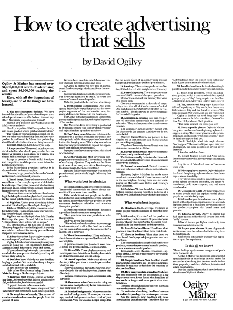
The reason for this makes sense and Ogilvy himself says it best: “On average, five times as many people read the headline as read the body copy. When you have written your headline you have spent eighty cents out of your dollar.”
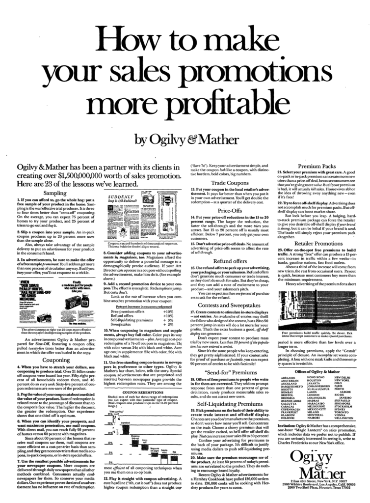
This also shows in his “How to create advertising that sells” ad (see below): 7 of the 14 points related to print advertising are about the headline.
Occasionally, he adds a subtitle that establishes his authority – why you should trust and listen to him – and the benefits for the reader, but he often leaves this for the opening paragraph.
Lesson 2: Establish Authority, Benefits And Intrigue First
If the reader is unsure if the article is meant for him or not after reading the headline, Ogilvy’s first paragraph makes it very clear.
He:
- Establishes authority with results in $$$, number of offices or clients, case studies or some other quantifiable measure
- Clearly states what you, the reader, can expect and how this benefits you (reminds me of Sugarman’s style)
- Creates intrigue and curiosity. Some examples:
- This is an insider’s notes that we’re sharing.
- This is the ‘abbreviated’ form (aka we have more, but you’ll have to contact us for that. A great filtering mechanism)
- The lessons we’ve learned (works because authority was established in the 1 or 2 sentences prior)
To achieve the above 3, Ogilvy stresses the importance of research. In his own words: “Advertising people who ignore research are as dangerous as generals who ignore decodes of enemy signals.”
My takeaway: spend more time researching what the reader wants and how he/she talks about it so you can (more easily) write (and sell) in a way that gets attention.
Lesson 3: Let Case Studies, Data And Results Do The Talking…In 1 Sentence
I’ve already mentioned Ogilvy’s use of large dollar figures and (client) name-dropping to establish his authority. This works to create trust and give the reader the feeling he won’t waste his time.
What truly establishes Ogilvy’s expertise, however, is the information he provides.
In his ads, he gives his best advice away for free…with the disclaimer at the beginning and the end that “this is an abbreviated form” and “clients get access to more”.
This is stunning considering the amount of information he provides…all numbered to further emphasize the volume.
He’s also extremely transparent and backs everything up with:
- Case studies and results with clients – all in 1 sentence.
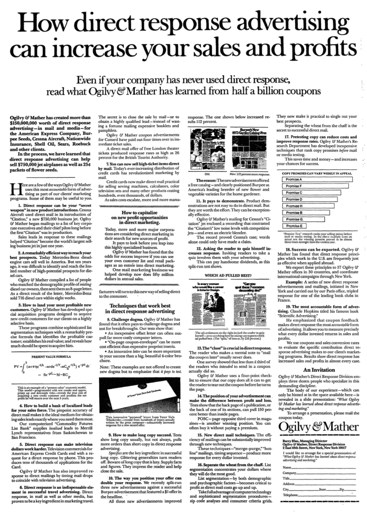
- Tables and charts with his own data. Shows originality and solidifies his expertise.
- A/B tests and experiments – with results – that he’s run on his own.
The way he writes emphasizes this authoritative approach: he states everything as a matter of fact and refers to himself in the third person. A strong contrast with the more personal “you”-oriented style of writers like Bencivenga.
Commonly used phrases that illustrate this best:
- “It pays to…”
- “Look before you leap”
- “Ogilvy & Mather has found (that the odds for success improve if)”
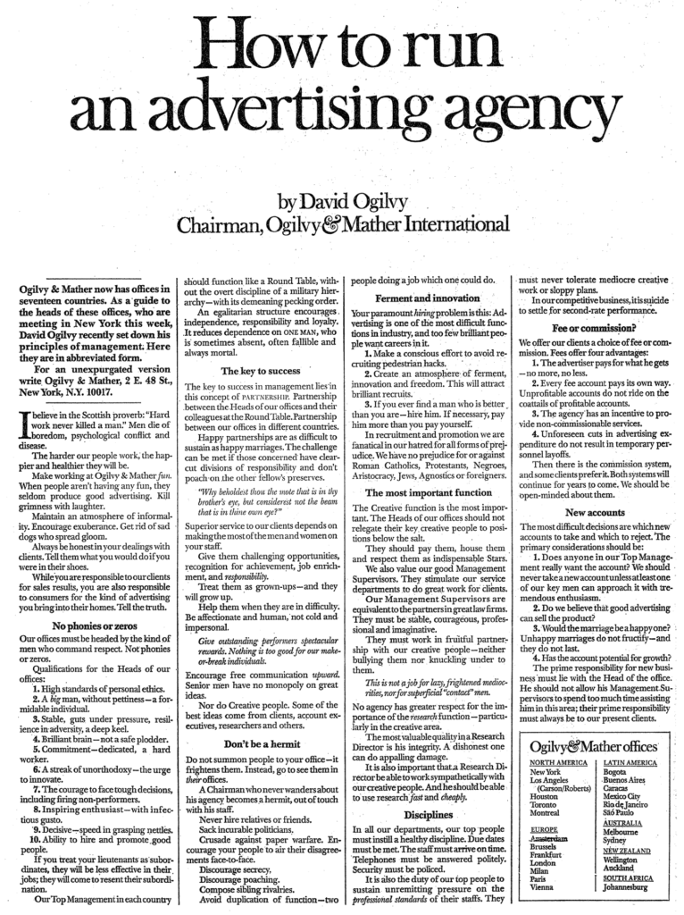
A great example of this in practice is his “How to run an advertising agency” ad (see below).
It:
- is an ‘insider’s note’ on what it’s like to work at Ogilvy. Shows experience and past effort. Also useful for attracting new employees and managers.
- Features management principles that can be applied to other businesses. Business owners will either agree (I’ve experienced that) or learn something new (I should try that). Either way, authority has been established and the result: I want to work with Ogilvy & Mather.
- Lets readers and potential clients self-select based on the values mentioned. Whoever applies – in whichever fashion – is likely a good fit.
Lesson 4: Inform To Persuade
Ogilvy doesn’t try to persuade. He simply informs the reader and lets the facts do the talking.
As he says it: “The more informative your advertising, the more persuasive it will be.”
How he makes his points:
- This is what most people or businesses do & why they fail. Followed by case studies and why you should do the opposite. If he doesn’t have a case study, he simply says “this works.”
- Uses “However” to create a contradiction.
- Usually he ends paragraphs with it, but sometimes he starts a sentence with “this pays”. He doesn’t back it up but has established his authority earlier for the reader to simply trust him.
- Mentions a condition that needs to be met to make something work. Interestingly, he often shows both what works AND why most fail. Encouraging people and dispelling myths/beliefs at the same time.
And every point is accompanied by an example, test result or case study.
But in order to persuade any reader, you’ve got to speak his language: “If you’re trying to persuade people to do something, or buy something, it seems to me you should use their language, the language they use every day, the language in which they think. We try to write in the vernacular.” – David Ogilvy
Lesson 5: Letting Readers Skim
Ogilvy’s headline makes it clear what the ad is about.
His subheadings make it clear what a particular paragraph is about without giving away the punchline.
These allow the reader to skim, be informed and intrigued, and decide if the article is worth his time.
He creates breathing room with numbered lists, bullet points, images and italicized quotes.
Another Ogilvy staple: brevity.
Paragraphs are at most 3 or 4 sentences and the first sentence is always indented.
His longer paragraphs often start with a bolded phrase – again allowing readers to skim – and contain an italicized word to remember the main point.
He also combines two sentences and cuts out words by using – and , appropriately. Readers fill in the blanks.
Lesson 6: But Wait, There’s More…
Ogilvy’s endings are superb. For all his transparency and the quality and quantity of knowledge he shares for free, he always lets the reader know it’s only the tip of the iceberg.
Whatever authority he has established gets multiplied in his final paragraph.
Rather than explaining it, simply check these examples:
- “These findings apply to most categories of products, but not all. Ogilvy & Mather has developed a separate and specialized body on what makes for success in advertising food products, tourist destinations, proprietary medicines, children’s products – and other classifications. But this special information is revealed only to the clients of Ogilvy & Mather.”
- “The body of our experience – which can only be hinted at in the space available here.”
- “Ogilvy & Mather has a comprehensive, one-hour ‘Magic Lantern’ on sales promotion, which includes data we prefer not to publish.”
In contrast to other great copywriters like Gary Bencivenga or Joe Sugarman, some of his ads don’t even include a call-to-action (CTA). Ogilvy’s work establishes an overwhelming amount of authority and trust and ends with the company’s address. Readers who want more will self-select and find a way to them.
Very daring and bold, but exemplifies the power of Ogilvy’s written word.
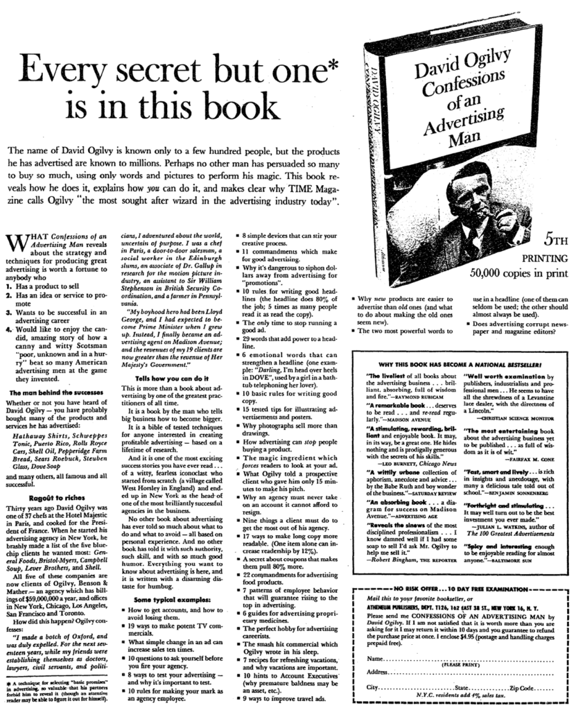
The one product ad I copyworked (“Confessions of an Advertising Man” – see below), he ended with the more traditional money-back guarantee and a coupon.
His closing line is one to remember: “If I am not satisfied that it is worth more than you are asking for it I may return it within 10 days and you guarantee to refund the purchase price at once.”
My takeaway: Always end with a ‘wait, there’s more’ statement.
Summarizing Ogilvy’s Structure and Style
Ogilvy’s advertising structure
- A headline that lets readers know what to expect.
- Establish authority, intrigue and the benefits to expect in the first paragraph. Let the reader self-select.
- Use subheadings that indicate the content of a section. Allows readers to skim.
- Use numbered lists, bullet points, quotes, images and graphs to make it easier to read, allow the reader to skim and further illustrate points.
- Reinforce statements with case studies, results, own tests and experiments, and graphs and charts.
- Brevity. Paragraphs are at most 4 sentences. Bullet points at most 2.
- Any paragraph of 3+ sentences either starts with a bolded phrase or has an italicized word that illustrates the takeaway. Or both.
- End with letting the reader know it was only the tip of the iceberg. More specific knowledge is available to clients. Ask without asking; when they come to you, you’re the one with the leverage. Let the interested buyer self-identify to increase the quality of the conversion.
Ogilvy’s advertising style
- Do your research
- What they’re looking for
- Language they use
- Test, test, test. Ogilvy: “Never stop testing, and your advertising will never stop improving.”
- Focus on one big idea; have one clear objective you want to achieve (perhaps that’s why he uses “how to” so often).
- You’re always writing for 1 person. Imagine it’s your wife/loved one.
- Tell the truth, but make it fascinating.
- All facts, all specifics, few/no adjectives.
- The goal is always to create something so interesting that the reader buys/converts.
My takeaway: Research your audience, know what to write that interests them and how to write it so it appeals to them. Then present it factually, clearly and with brevity.
My second takeaway: A call-to-action is unnecessary if the reader likes what he has read and knows there is more where that came from when working with you (or buying whatever you sell).
The father of advertising himself says it best: “A good advertisement is one which sells the product without drawing attention to itself.”
And: “If you’re trying to persuade people to do something, or buy something, it seems to me you should use their language, the language they use every day, the language in which they think.”
Not to forget: “Do not … address your readers as though they were gathered together in a stadium. When people read your copy, they are alone. Pretend you are writing to each of them a letter on behalf of your client.”
Comparing Copywriting Greats: Ogilvy, Bencivenga and Halbert
Promoting An Agency
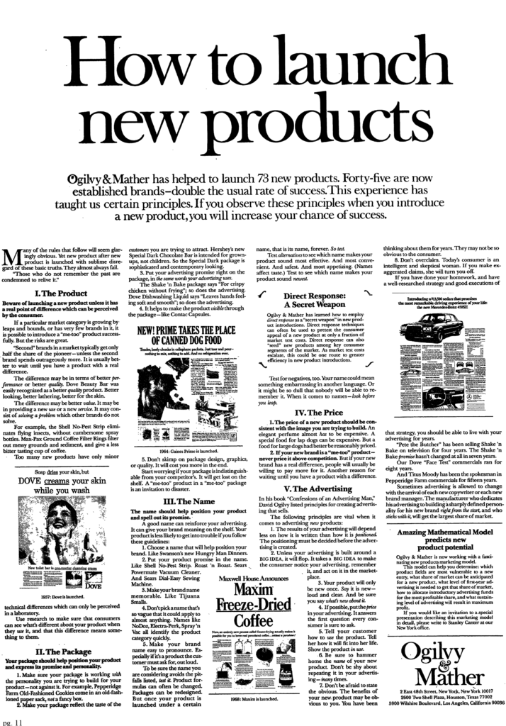
Both Ogilvy and Bencivenga have created an ad that promotes their own agency.
- Ogilvy: ”How to run an advertising agency” and “How to launch new products” (see below for both).
- Bencivenga: “Ad Agency Guarantee”
Great case study of different styles – both with great results.
In my opinion, Ogilvy’s is a great example for established agencies, while Bencivenga’s is great for new and unproven ones.
Promoting A Book
Ogilvy, Bencivenga and Halbert have all promoted books and have done so in different ways.
If you have you’re own book to promote, learn from the following ads:
- Ogilvy’s Confessions of an Advertising Man (see below)
- Bencivenga’s Do You Make These Mistakes In Job Interviews
- Halbert’s Money Murder
I’ll leave my rough notes for Ogilvy’s ad below; the others you can review yourself by clicking on the above links.
“Confessions of an Advertising Man” ad notes
- First paragraph says briefly what it is and who it is for -> reader self-selects
- Second paragraph further establishes authority by showing the past clients/case studies -> also answers one of the questions in the subtitle
- Third paragraph builds relatibility -> where Ogilvy came from, the goal he set, what he has achieved + an excerpt from the book
- Fourth paragraph focuses on the practical without revealing anything (i.e. the benefits for the reader) -> kind of weak in my opinion
- Fifth paragraph is similar to Bencivenga: all the ‘techniques’ and ‘tactics’ people can expect in the book.
- Heavy use of numbers
- Triggers either with numbers or 5W1H -> everything written in one short sentence
- Doesn’t reveal the how, only mention the what
- Feels even shorter than Bencivenga’s book ad
- All are related to the 4 target audiences identified in the first paragraph.
- All focus on solving problems or revealing ‘secret techniques’ that improve performance.
- All are centered around Ogilvy’s authority/expertise, less about mentioning the benefits. He doesn’t spell it out for them, unlike Bencivenga.
- Sixth paragraph has a border and is filled with testimonials and reviews from readers & newspapers. 2-3 sentences each, with parts bolded.
- Final paragraph is a coupon with a 10-day money-back guarantee.
- Very nice sentence to use: “If I am not satisfied that it is worth more than you are asking for it I may return it within 10 days and you guarantee to refund the purchase price at once.”
- Changes the perspective from “you” to “I/me” -> strengthen commitment
David Ogilvy Swipe File
Pingback: Joseph Sugarman - How To Write Addictive Copy
Pingback: Gary Halbert - How To Write Copy That Sells - JIM BOUMAN