10 days of copyworking and analyzing Joseph “The World’s Highest Paid Copywriter” Sugarman print ads has taught me the following lessons.
I hope it helps you improve your writing.
Sugarman swipe file at the bottom.
- Lesson 1 – Joe Sugarman’s Formula
- Lesson 2 – Headlines and Subheadings
- Lesson 3 – Write Like a Customer
- Lesson 4 – Increasing Perceived Value
- Lesson 5 – Establishing Authority
- Joe Sugarman vs Gary Bencivenga
- Bonus Lesson – Interesting Product Comparison
- Bonus Lesson 2: Interesting Ending
- Sugarman’s Copywriting Example For Collecting Donations For Charity
- Joseph Sugarman Swipe File
- Lessons From Other Great Copywriters
Lesson 1 – Joe Sugarman’s Formula
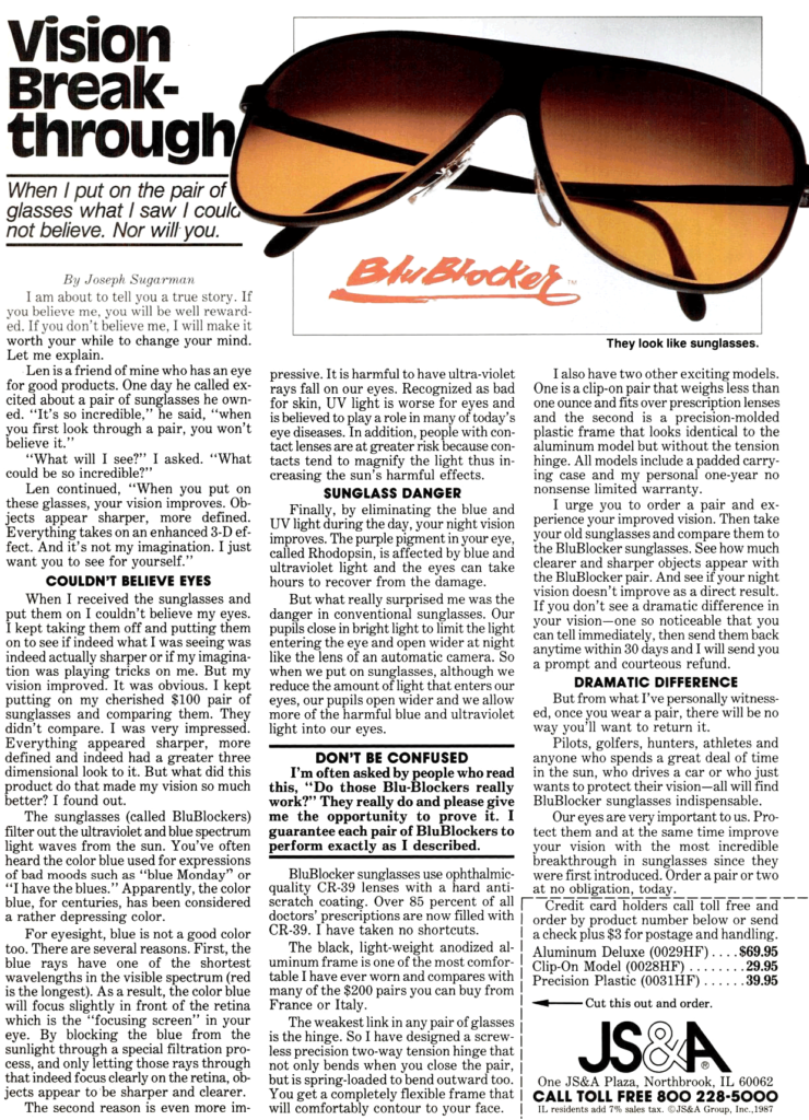
Sugarman:
- Likes to start his ads underwhelmed or disappointed
- Then by means of experiencing the product firsthand, discover what makes it good or unique
- Go in-depth on its features and benefits
- Compare with other, more expensive products – and describe in a first-person view how his product offers the same features and benefits (in addition to the unique feature)
- Ends with a strong conviction that the product achieves the 1 desired benefit and offer a no-loss, money-back guarantee
His ads focus on:
- These are the benefits / results you’ll gain
- Here is why that is the case
- This is my experience
- The benefits are guaranteed because of this 1 unique feature
- Try it and if you don’t notice an effect immediately, return it and receive your money back, no questions asked.
This style creates certainty, takes away doubt, makes committing easy and ends with a possible association to social groups (“pilots, golfers, hunters, athletes”) the reader wants to be a part of, triggering herding behaviour.
He describes situations and experiences that everyone has from a first-person perspective. This helps the reader visualize and place himself in Sugarman’s shoes. It feels like listening to a friend’s story, which builds trust and connection between Sugarman and the reader. It also creates a slippery slope where the reader continues to read, forgets he is being sold to and his subconsciousness makes the purchasing decision for him.
Lesson 2 – Headlines and Subheadings
Write a short headline that evokes curiosity.
One that makes you think “what does that mean?”
Sugarman’s subtitles include these two components:
- A benefit for the customer – what’s in it for them? what do you want them to know?
- Create intrigue with
- novelty or
- contradiction – the situation was like this, but now it’s become this
Sugarman uses 4+ subheadings throughout a print ad. These are used to break up the pace and, interestingly, can be read as their own story when simply glancing at the ad.
This is different from Bencivenga who generally writes one long story, only adding subheadings for “bonuses”.
Lesson 3 – Write Like a Customer
Sugarman started most ads from the perspective of a customer – what his thoughts and expectations were for the product and what (positively) surprised him about it.
He takes you on a journey of discovery by an average Joe, making the entire scenario relatable to his target audience.
Style-wise his ads read like an everyday conversation among friends.
Halfway through an ad he tends to switch to the seller’s point of view and focus more on explaining the features, and subsequent benefits, of the product.
He states clearly what a reader might be thinking – as if he’s having a conversation with them – and says why their concerns are unwarranted.
He also explains in detail – as if he’s experienced the product firsthand – how the product makes life easier.
Most of his ads focused on “space-age products”. This focus made it easier to write many high-performing print ads as the target demographic and products share similarities among the various ads.
Whenever he explains something technical, he uses terms that people know to improve their understanding (“focusing screen” and “like the lens of an automatic camera”).
One interesting thing I couldn’t really place elsewhere on this page is Sugarman’s style of boasting that he uses occasionally.
Simply put: when boasting, exaggerate so greatly it’ll make you chuckle.
Or as Sugarman wrote it in his Magic Baloney ad: “We discovered that the Magic Stat was probably the most consumer-oriented, technologically-advanced and most sophisticated thermostat ever developed on the face of this earth and in our galaxy for all times ever.”
Lesson 4 – Increasing Perceived Value
While Bencivenga often uses bonuses to increase the perceived value of the main product, Sugarman compares his products with luxury brands or competitors who charge high prices for a similar product.
His products are often 80% cheaper and thus seem like a steal to the reader.
Of course, they only seem like a steal since Sugarman convinces the reader that his products are in no way inferior, and often times even superior, to the products and brands he compares his product to.
When comparing to luxury brands, he wants readers to associate his product with craftsmanship and give it a certain authority.
When comparing to expensive competitors – that often target a different market – he wants readers to know they’re getting an insane deal. He backs this up by explaining how they can be so much cheaper by indicating a manufacturer’s expertise in the area.
Everything is focused on establishing authority, luxury and novelty, no matter how simple the product is.
He also ensures that every feature is accompanied by a benefit or special experience for the reader.
As with Bencivenga: focus on benefits, not features.
Lesson 5 – Establishing Authority
Sugarman shows that if you’re writing is good enough, products don’t need awards, prior results or external validation.
He establishes authority and trust for a product with simply his conviction or opinion based on his experience.
His storytelling is what sells the product:
- Start with something outrageous (like a “new NASA invention) or how the product seemed underwhelming
- Describe your experience and the one feature that made you change your mind
- Compare the product to luxury brands or other similar products out there, and how this product offers all that – and more – at a better price…and how the manufacturer has been able to achieve that
- And remember the finishing touch: a strong money-back guarantee that ensures no loss for the consumer. You have nothing to lose (and everything to gain).
Sugarman’s success shows you that people become gullible when an ad reads like a story, rather than a sales pitch, which makes readers wary – most don’t like to be sold to after all.
This doesn’t mean that Sugarman never uses external validation: he uses it wherever he can. Nothing creates trust and desire like testimonials, reviews, awards and anything else that people perceive as external validation of a product.
Just know that authority and trust can still be established without it.
Joe Sugarman vs Gary Bencivenga
Similarity
Both copywriters end their ads in a similar style: mentioning the expected benefits and results again and having a strong, no-loss, money-back guarantee.
They both associate the guarantee with the product’s main benefit (and what they want people to remember). It’s guaranteed to produce this result, or else you get your money back.
What we can learn:
- End with a guarantee – both warranty and the notion that the product is unlike anything else (now or in the future). The offer can only be compared to itself.
- Indicate the trial period and refund option.
- Conviction that this product is the best in the world at what it sets out to do.
- Call-to-action – what the consumer needs to do to purchase the product.
Difference
Bencivenga focuses on benefits and future-pacing: this is what I – the reader – want and can have if I use this product.
Sugarman, on the other hand, focuses on storytelling and making the scenario relatable: this sounds like me – the reader – and what I’m experiencing. I want this same (new) experience.
Bonus Lesson – Interesting Product Comparison
Sugarman compares his product with competitors, without naming them, by saying for example “five common problems you can forget about.”
- Addressing common problems increases the relatability with the reader
- Gives him an opportunity to discuss how his product’s features and ease-of-use resolve these problems (easily and without effort) and create a ‘no-loss-if-you-try’ feeling. Remember: focus on the benefits, not the features.
Bonus Lesson 2: Interesting Ending
Found in the NASA Hits ad (see below): “If you wish to order additional units for other appliances at $ 29.95, you may, but we suggest you test the refrigerator module first and totally convince yourself.”
Building a relationship through the written word is difficult, so I found this sentence interesting. It adds transparency and a feeling of care for the consumer.
It also gives the feeling of “we don’t need to sell you this; the product is so good that it sells itself and you’ll agree after trying it.”
Sugarman’s Copywriting Example For Collecting Donations For Charity
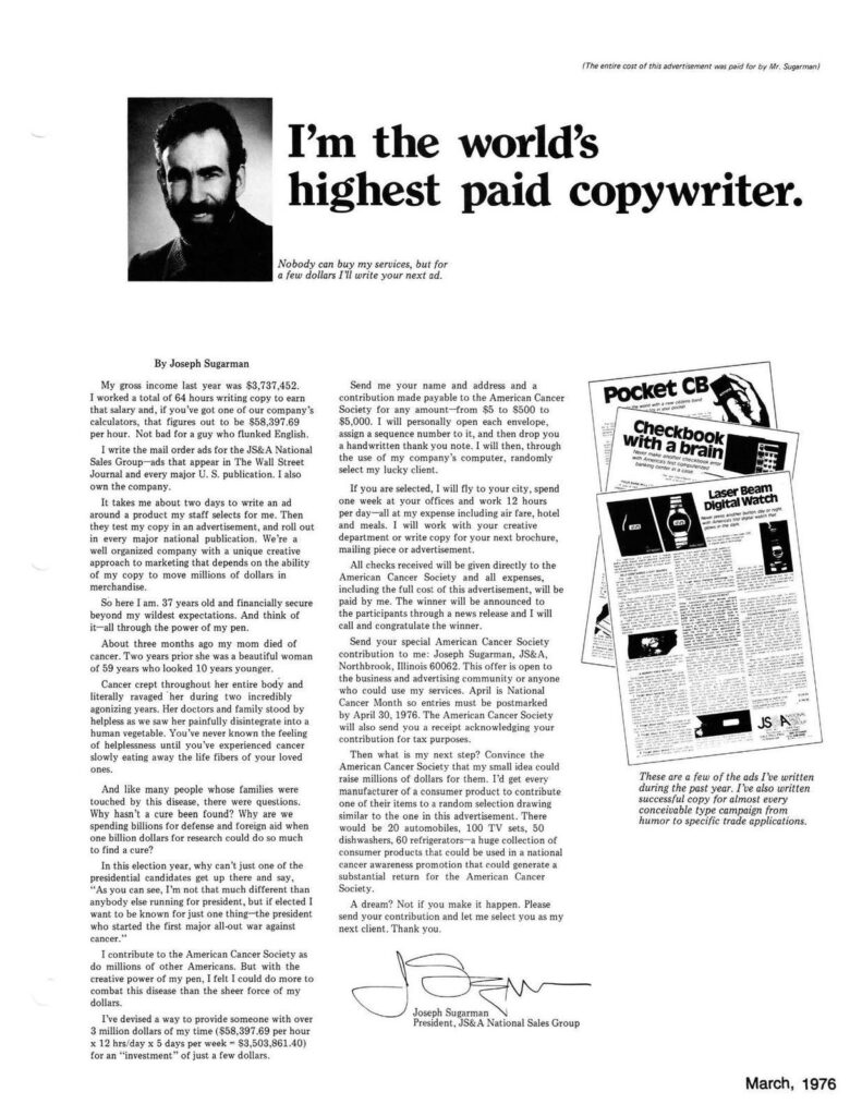
Below are my rough notes of Sugarman’s “World’s Highest Paid Copywriter” ad. (see below)
- Write a personal letter with personal stakes and, as always, there is nothing to lose for the reader (but everything to gain).
- At the top of the ad is mentioned “The entire cost of this advertisement was paid for by Mr. Sugarman”.
- Title and subtitle create intrigue and exclusivity like it’s a one-time offer.
- Title: “I’m the world’s highest-paid copywriter.”
- Subtitle: “Nobody can buy my services, but for a few dollars I’ll write your next ad.”
- Immediately establishes “I’ve reached your dream – here’s how I do it” kind-of-feeling in the first section. A huge dollar amount also leaves an impression.
- Spent the first 25% of the ad establishing authority and “I don’t need to work anymore, so this is all voluntary” without explicitly stating that.
- Dedicate the second 25% to his mom’s losing battle with cancer + his feeling of helplessness that only people who have experienced the situation can understand + possible solution (more dollars for research). He tries to convey the feelings and thoughts to inexperienced people and generate sympathy, empathy and, at worst, separate the interested from the non-interested readers (who this is for vs who this is not for).
- Dedicate the third 25% to explaining the reward process.
- “I will do xx and yy for you” at no cost to you (i.e. no loss for the reader). The “I will do these things for free, potentially for you” has weight because of his authority built in the first 25% of the ad. This section is also right below the header and subheader (start of the right column). Coincidence?
- Added benefit: everything the reader gives is 100% a donation and tax-deductible.
- The final 25% is the CTA (what/when/how to do next) + what Sugarman himself will do next, indicating that he is already taking action. This creates feelings of guilt, commitment and reciprocity within the reader. He also shows appreciation and a call for a joint mission/vision, and we all like to be a part of something greater than ourselves…that we still feel relates to us in some way.
- The final two sections are aimed, I think, to generate feelings of reciprocity and guilt within the reader
Joseph Sugarman Swipe File


Pingback: David Ogilvy - How To Write Copy Like The Best
Pingback: Gary Halbert - How To Write Copy That Sells - JIM BOUMAN
Pingback: Gary Bencivenga Bullets - Lessons From A Great Copywriter